Printed Words Interviews – Part One
Issue One
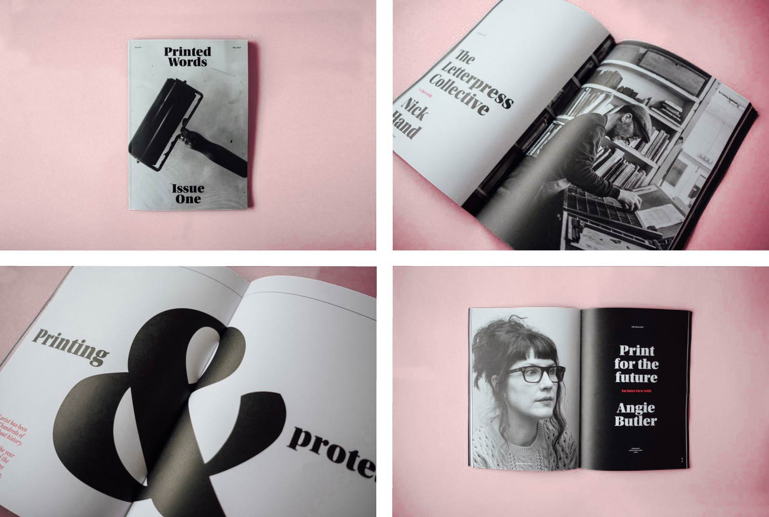
Printed Words is a magazine that started as a university project in my final year. I soon discovered that it had the potential to be much more than that. Issue one explored traditional print methods which featured interviews from printmakers and graphic artists all around the country including legendary printmaker Anthony Burrill and the journeyman, Nick Hand.
After leaving university, I decided to take a break from the magazine to focus on my career as a graphic designer here at John&Jane. Now that I have found my feet in the industry I decided to start work on issue two, which will be focused solely on typography—it's function and beauty but also those who are renowned for designing or using it.
Issue Two
Focussing solely on typography, I intend to explore the typographic changes to the Guardian and finding out more about the biggest names in typographic design. The first two interviews to feature in issue two will be Colophon Foundry and Erik Spiekermann.
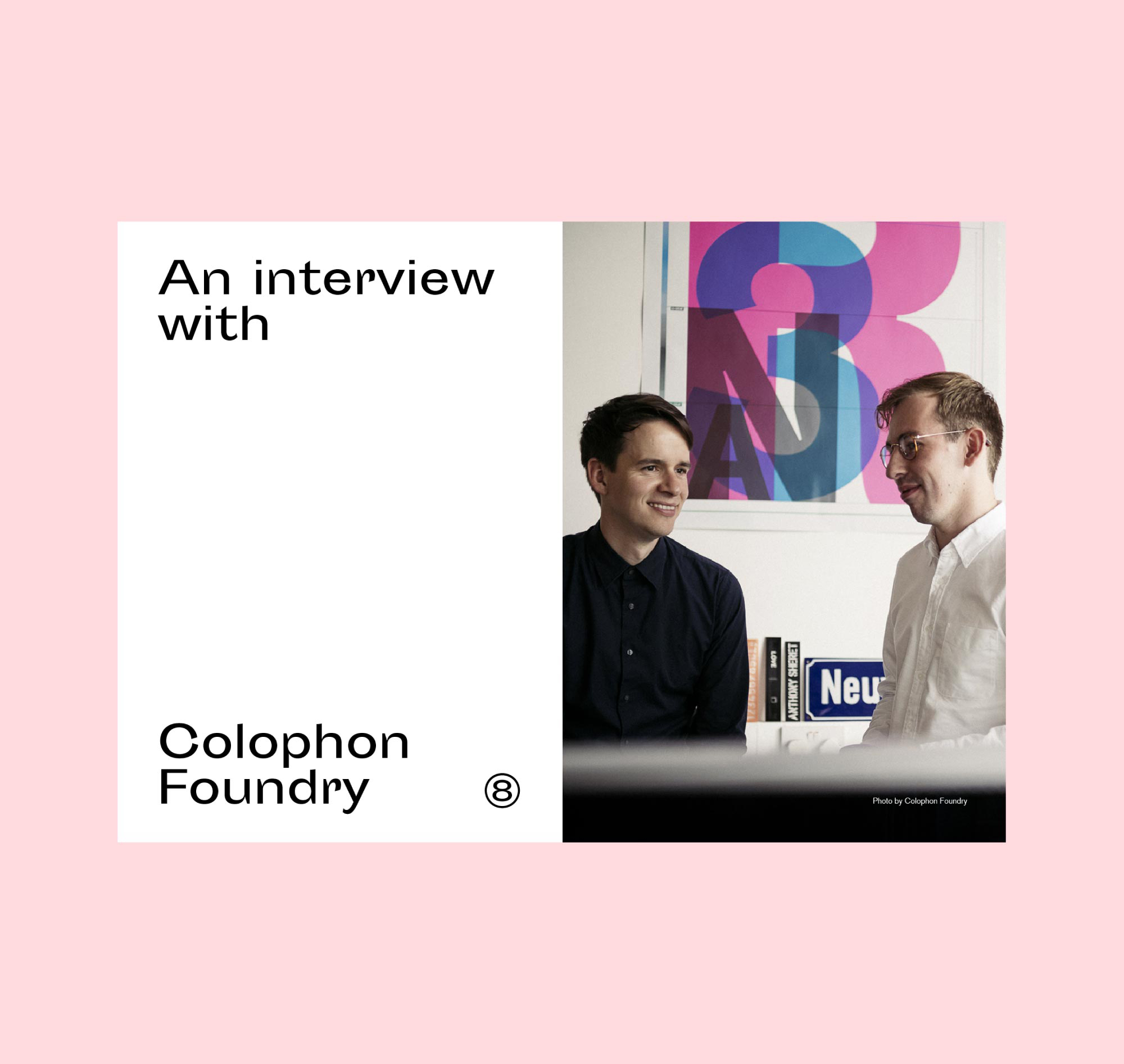
Interview One - Colophon Foundry
I caught up with Anthony Sheret from Colophony Foundry to talk Wales Sans and how the foundry came to be. I decided to ask Anthony about the Wales project which won Best of Show, Gold in the 2017 European Design Awards, how they became involved and how important it was that a place have it's own typeface.
For this issue, I wanted to focus on the function of a typeface and how it impacts a brand, as well as the processes from leading type designers within the industry. Colophon being an independent foundry I thought it would be insightful to chat about what it means to be independent and how that affects a clients perception.
This interview will be the first in the new issue printing later this year.
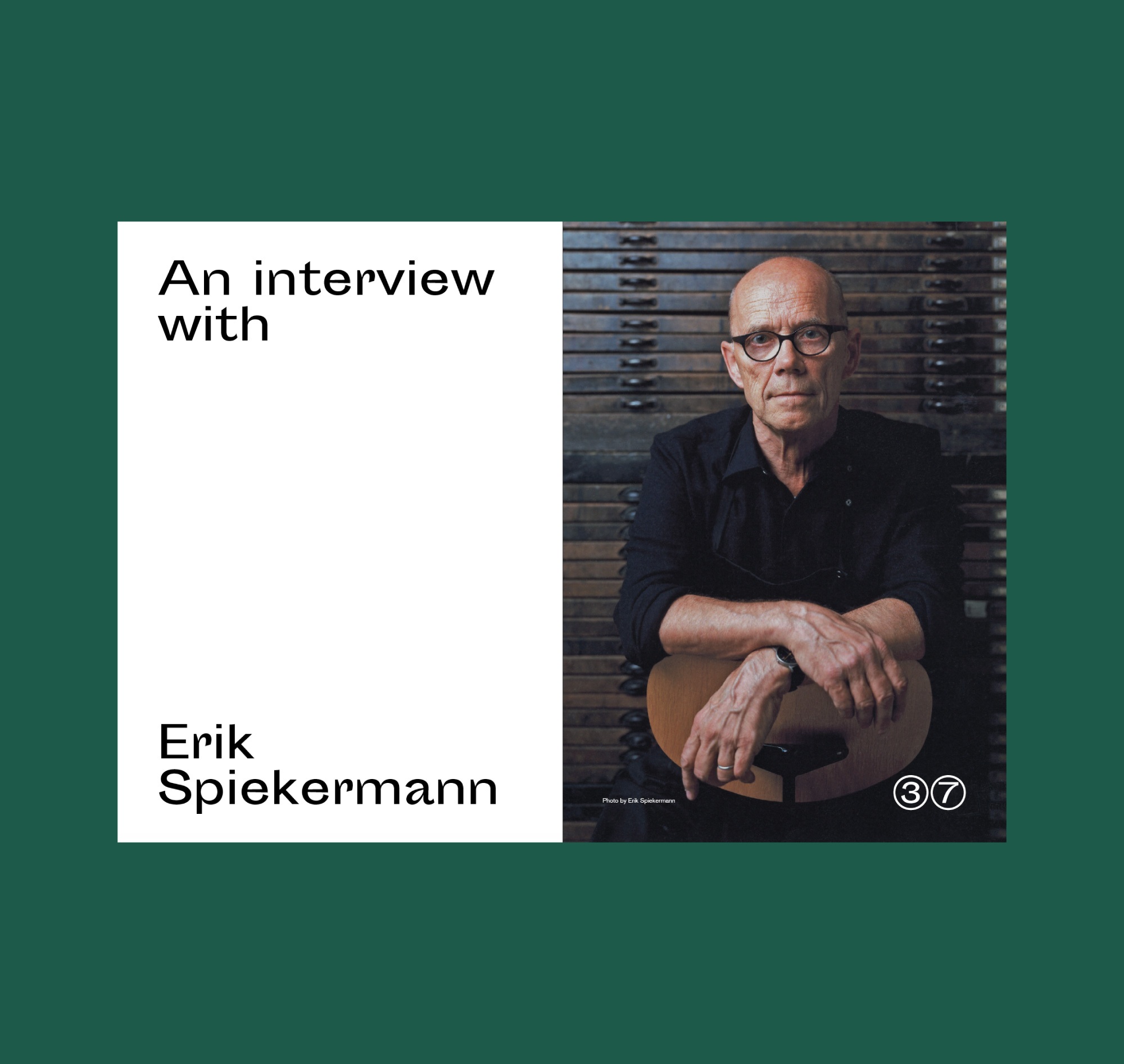
Interview Two - Erik Spiekermann
Erik Spiekermann is one of most well-known typographers and designers in this day and age. He has designed for brands such as Nokia and created many typefaces such as FF Meta, FF MetaSerif, ITC Officina, FF Govan, Berliner Grotesk and many others.
Aside from founding Edenspiekermann in 2009 he now runs an experimental letterpress workshop in Berlin. I spoke with Erik about the fundamentals of typography and his personal experiences in the industry from freelancing to working on projects such as Nokia.
Stay up to date
If you would like to follow developments of the making of Printed Words, issue two and find out where and when you can get your hands on it—head over to the @PrintedWordsMag Instagram account.