Prosecco Pronto
Inspired by Italy
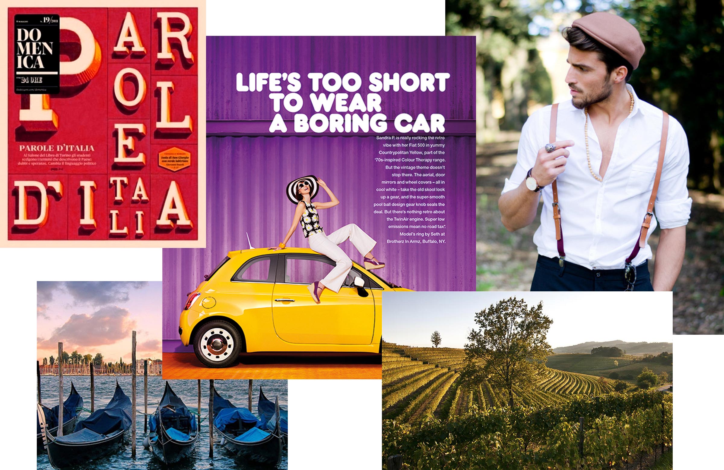
With the Piaggio Ape being a classic Italian vehicle and prosecco being one of Italy's most fashionable drinks it was hard not to turn to Italy in the research phase of this project. Famous for its style and flair, Italian typography and design was a great source of inspiration for the Prosecco Pronto brand and design style.
Identity
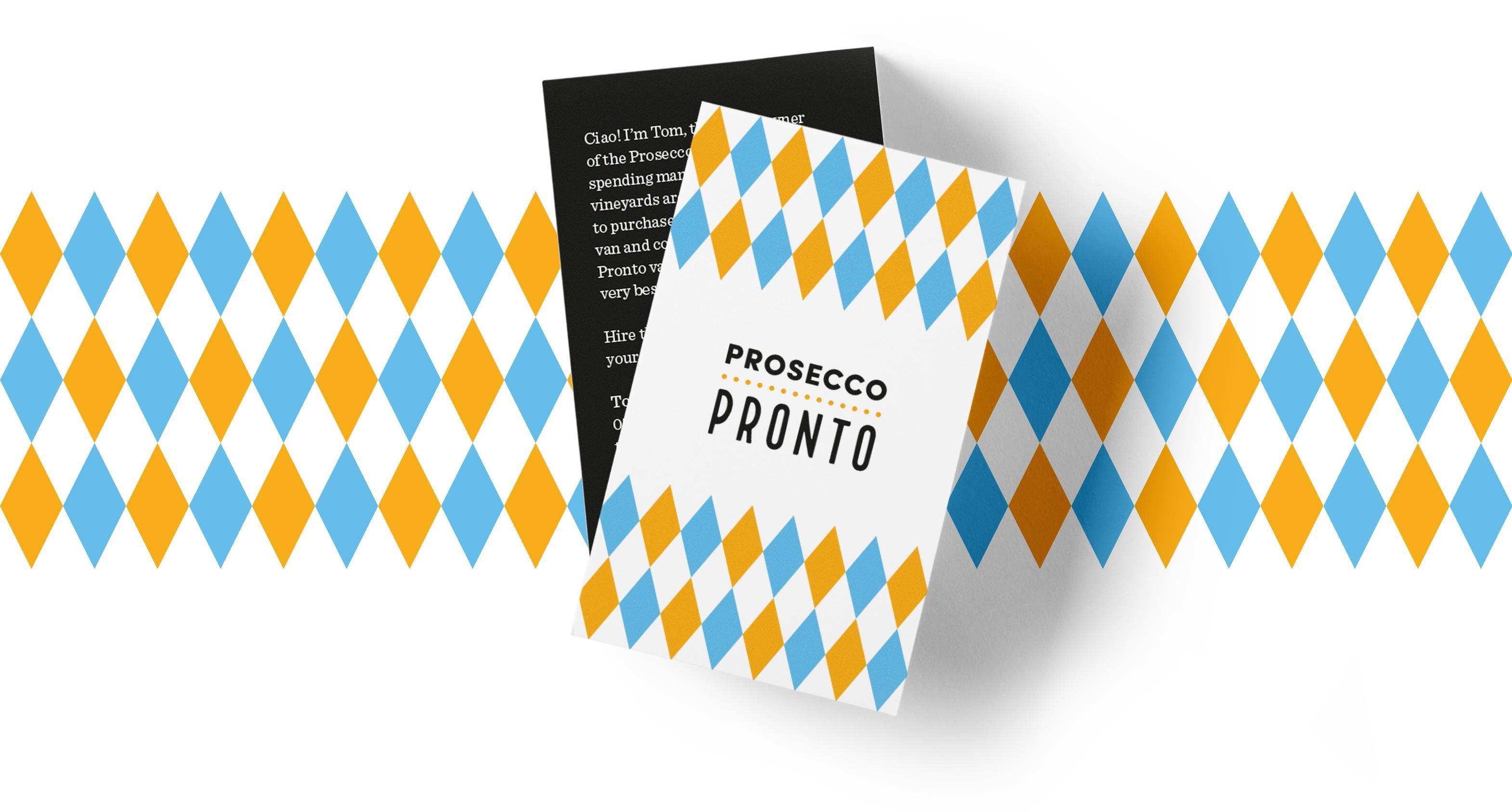
It was important that Prosecco Pronto was a versatile brand that could appeal to both the festival and events markets, as well as the wedding industry. We felt simplicity and character were key ingredients in making this identity and brand what it is. The identity itself used distinctive, Italian-inspired typography which was softened by the romantic strapline written in a calligraphic style.
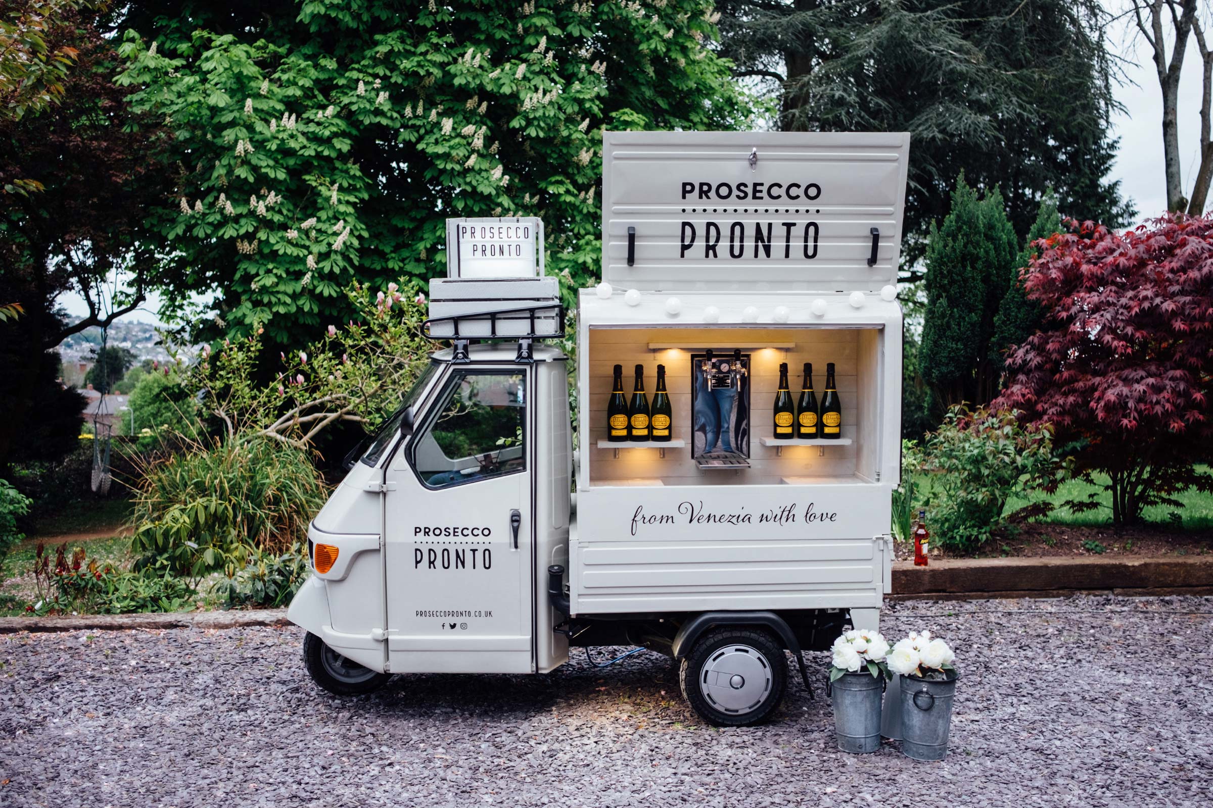
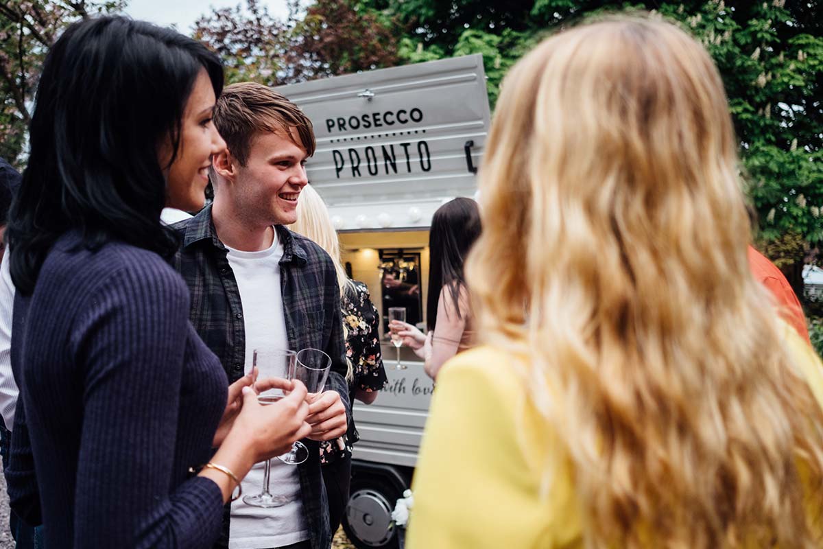
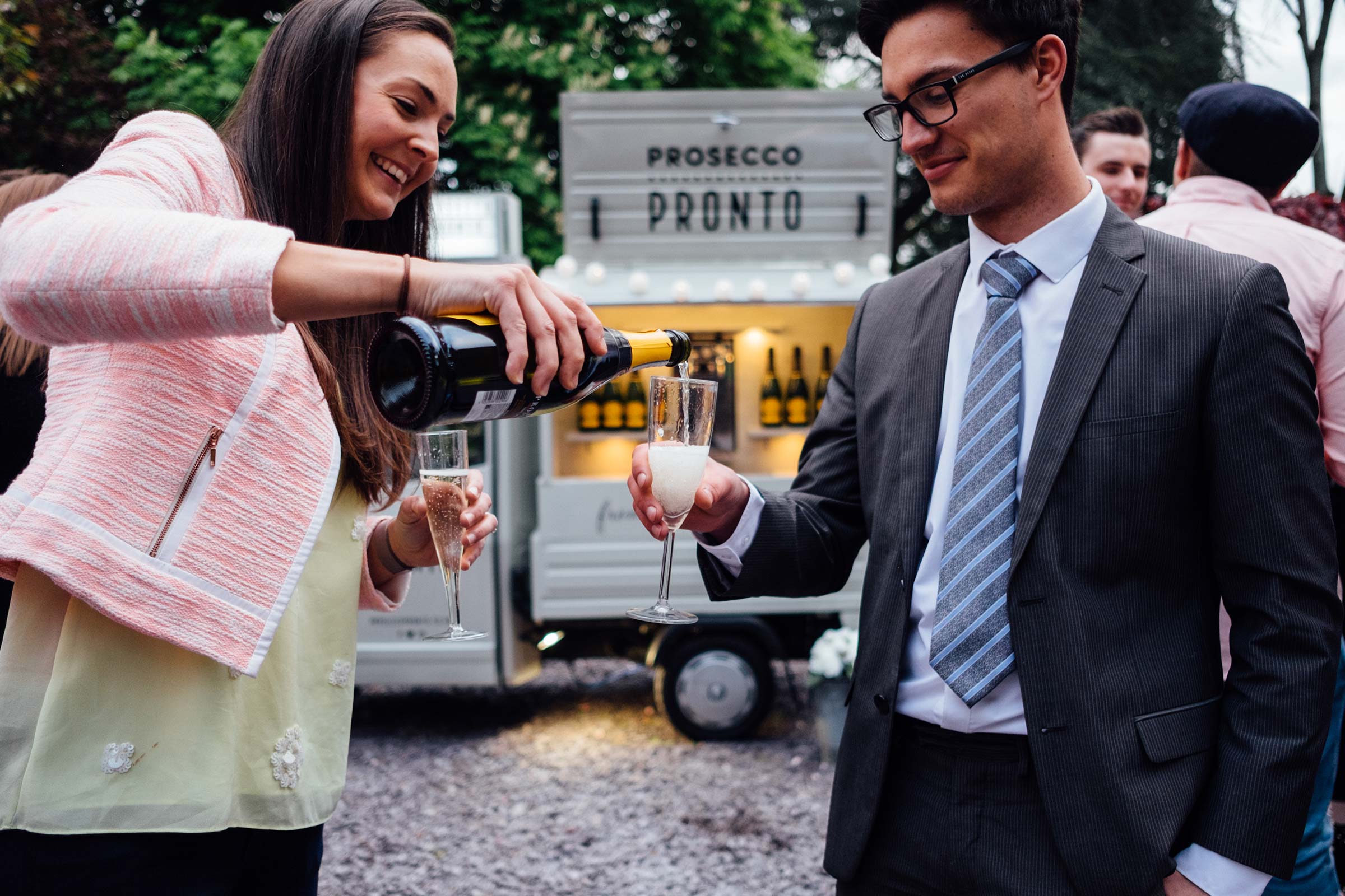
Piaggio Ape
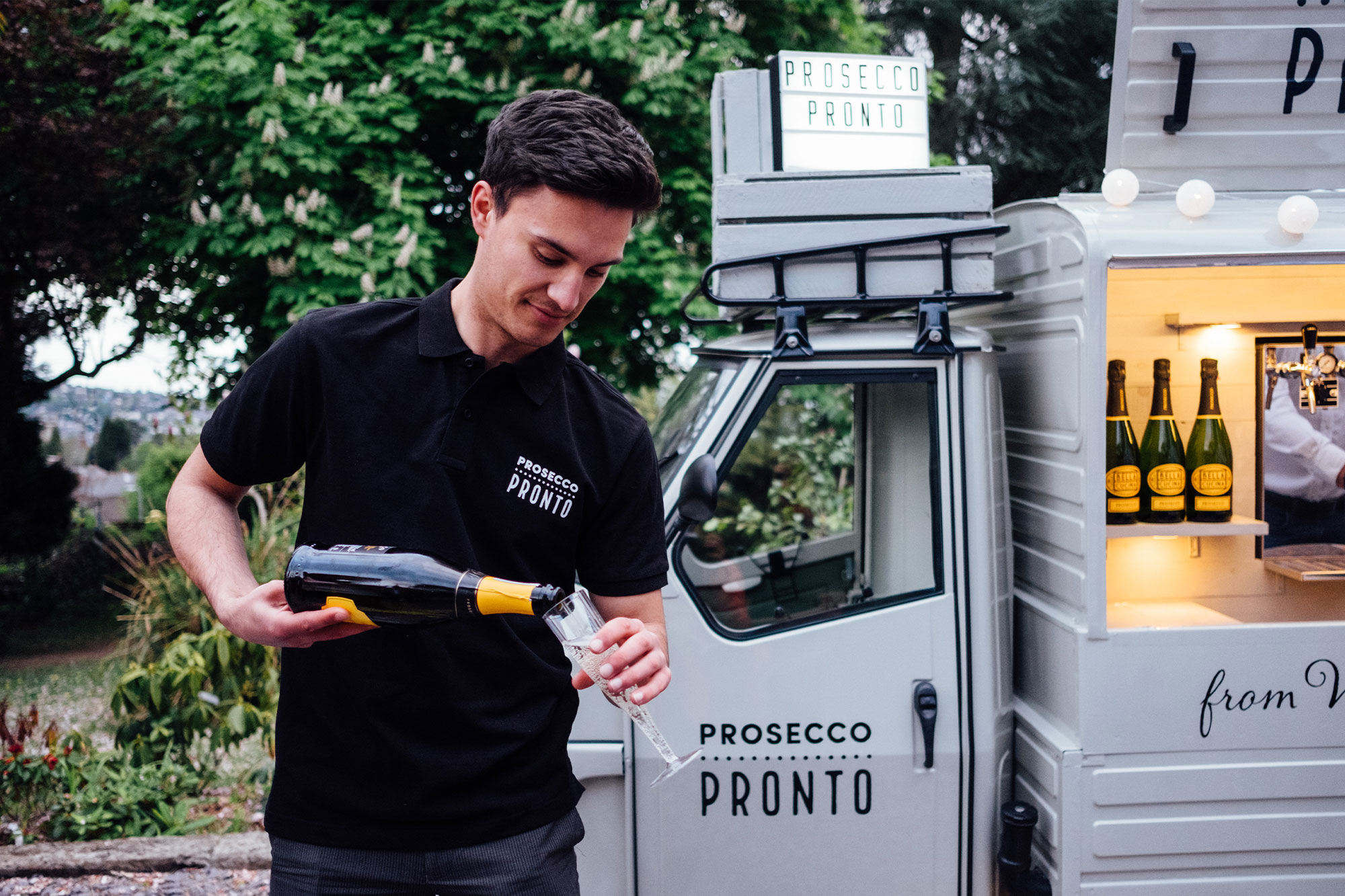
This is where the business truly comes to life. By sign-painting the graphics onto the classic Piaggio Ape van, it helped achieve an authentic and traditional look and feel. The typographic identity on the van can be dressed up and decorated with flowers and lighting—which can be adjusted and personalised for individual events.
Away from the van, more colour and complex graphics could be introduced. Using the brand yellow as the primary colour, we built a palette around it that was fresh and striking.
Prosecco Pronto is an independent, family-run business that has a fascinating story linking them back to the village of Prosecco, so we felt it was key to give a brief overview of this fact, even on the business cards.