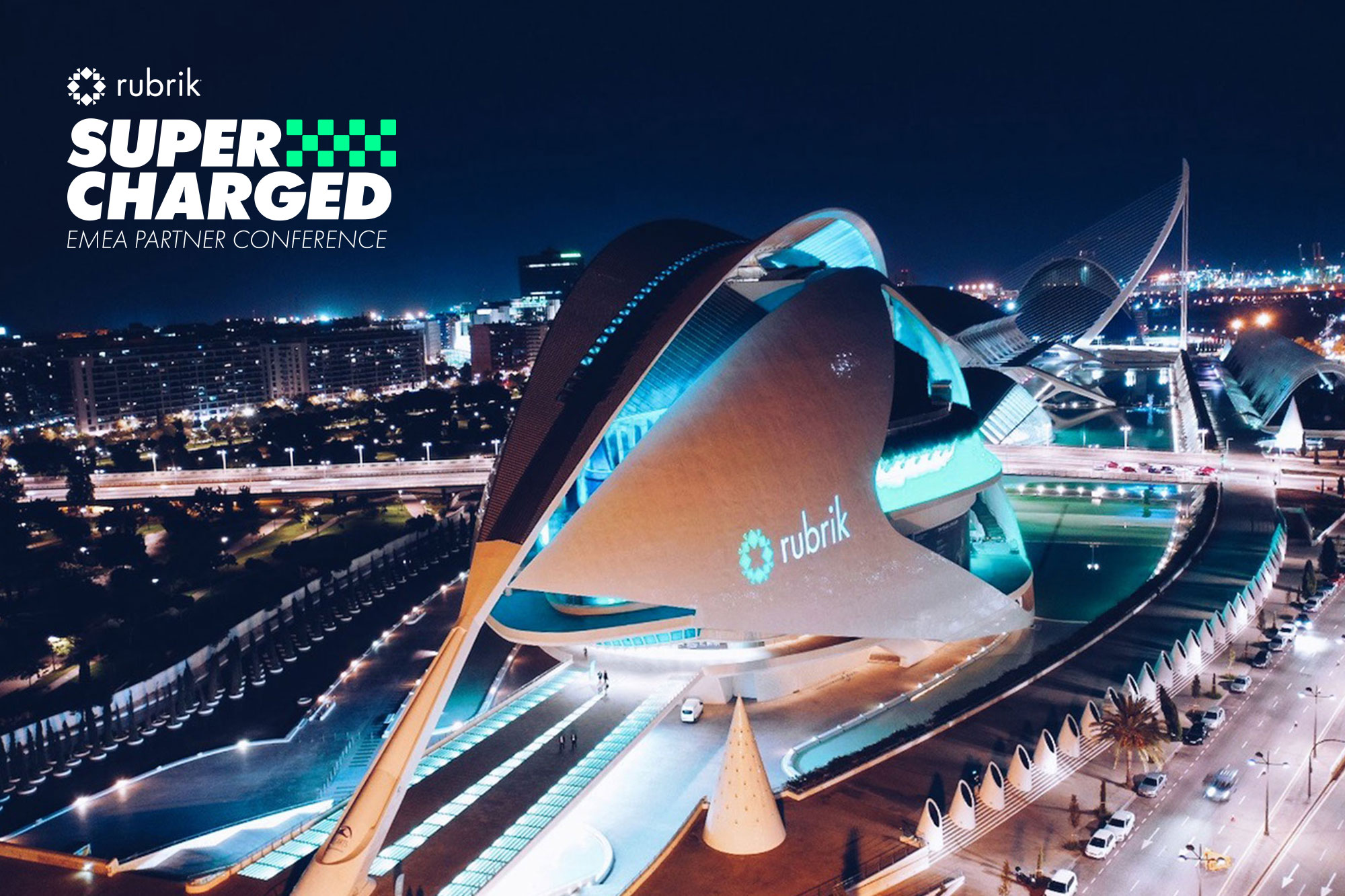
Rubrik Supercharged
We worked with Rubrik to create an identity for their annual partner conference in Valencia, Spain.
The Brief
Rubrik is a cloud data management company run from Palo Alto in California, with offices worldwide. They provide back up and recovery support to some of the world's most successful companies and are going from strength to strength. Each year they celebrate their partners by running a conference to share their progression and intentions whilst also getting everyone together to have a good time! They wanted to make sure that the conference reflected the unbelievable progress they have made with their business, they are working fast and refining their offering - they came to us for a brand that represented this success.
Inspiration and Naming
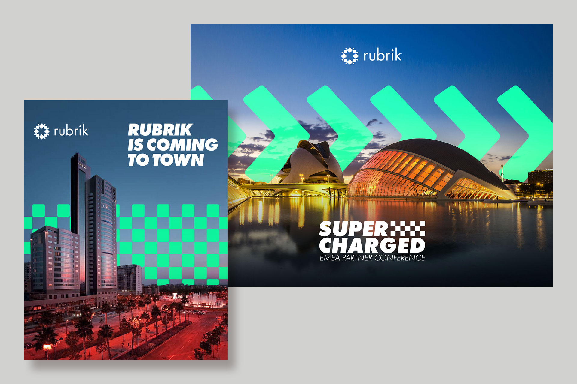
We were tasked with the naming as well as creating the look and feel of the conference. We knew that it was going to be run in Valencia and we were keen to create a brand that would live up to the modern look of the venue.
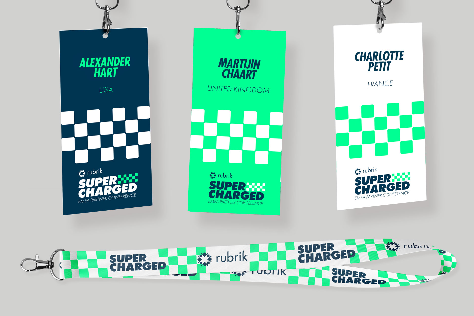
We started looking at the conferences that inspire us, like the AIGA Professional Association for Design conferences and London Fashion Week. What we love about these events is how they are branded to have their own, very distinctive identities and that the design style is coherent across the whole event, everything from the wayfinder signage to the attendee name badges and lanyards, we wanted to provide the same experience for the partners at Rubrik’s conference.
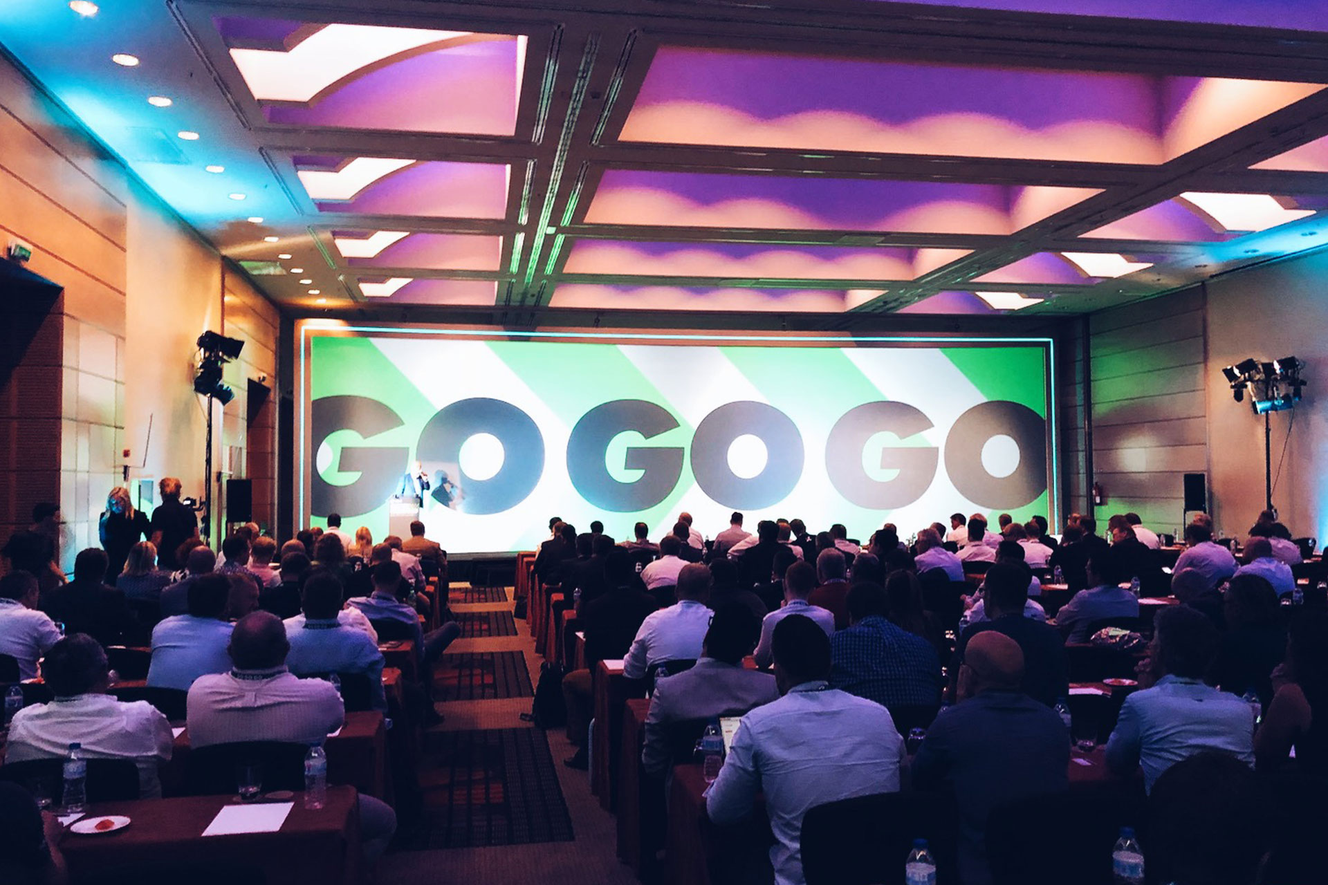
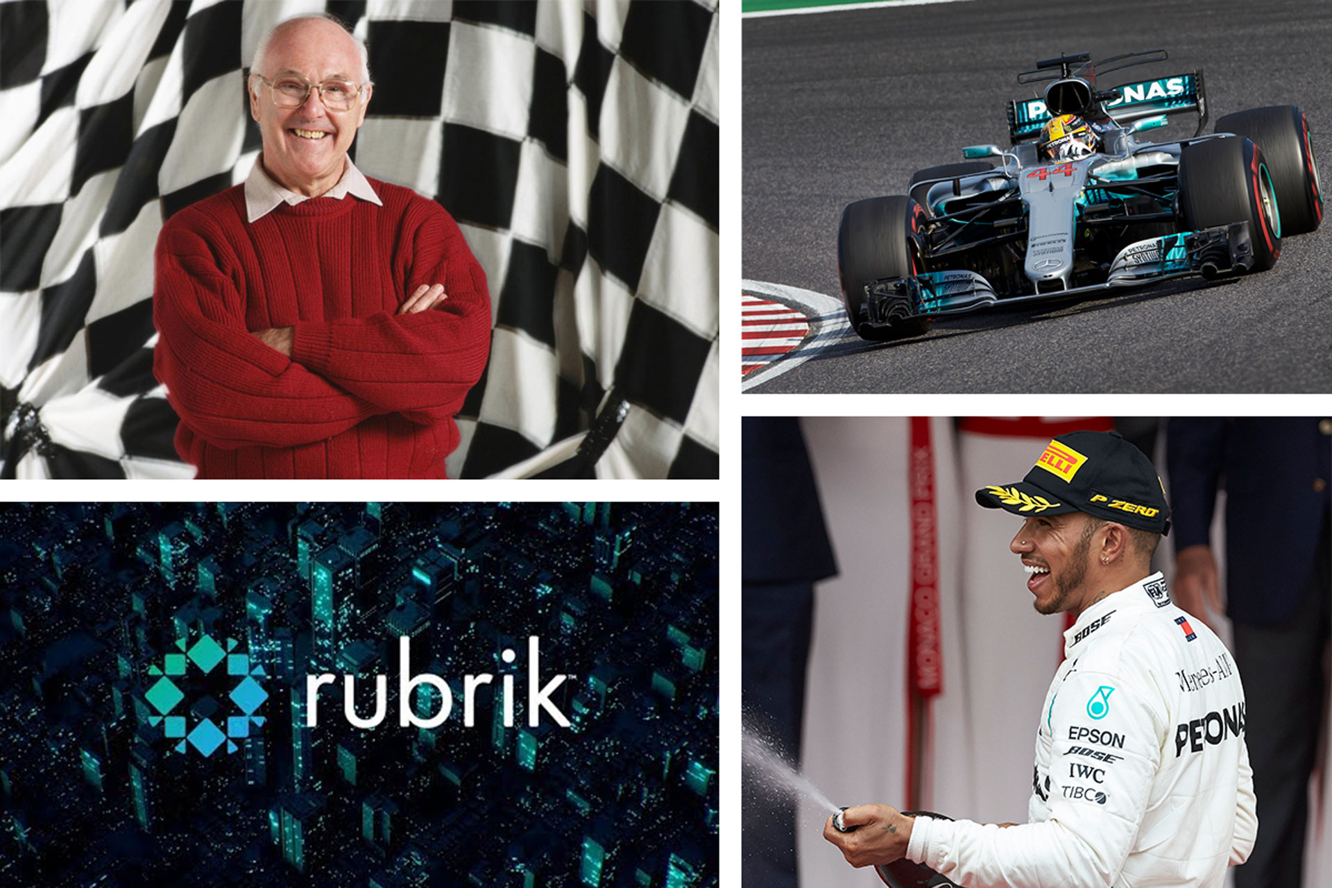
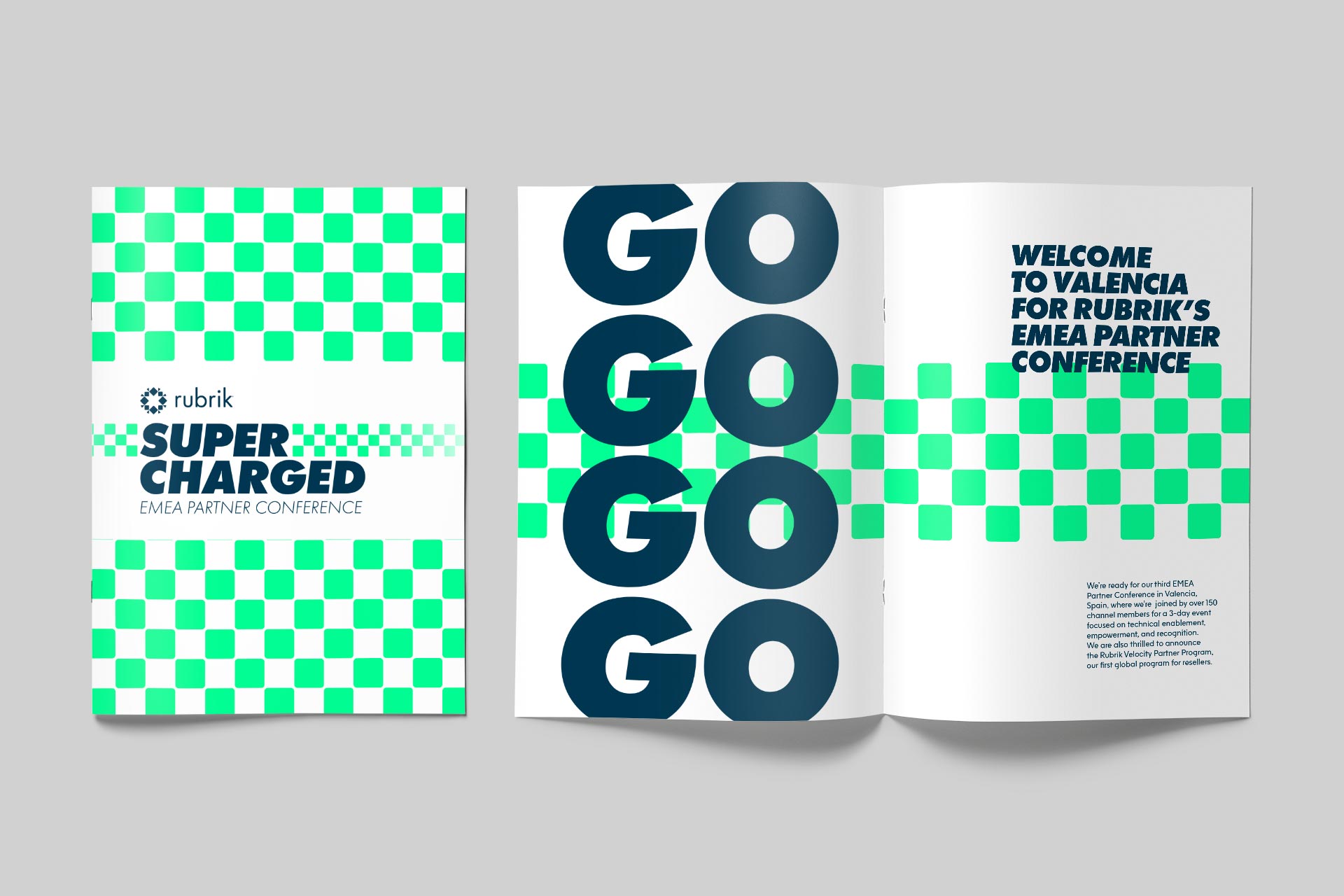
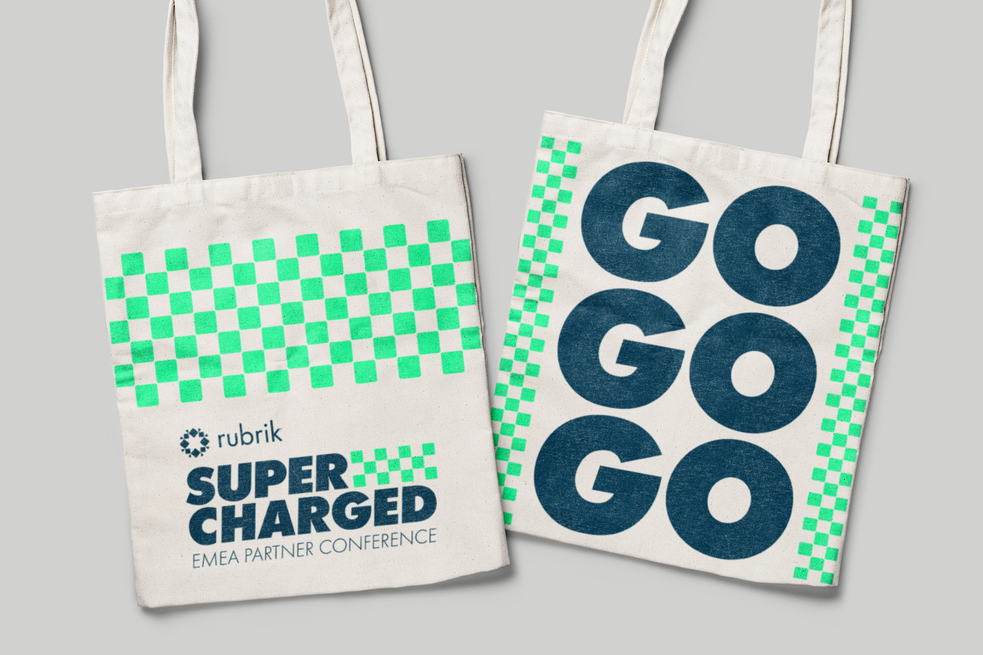
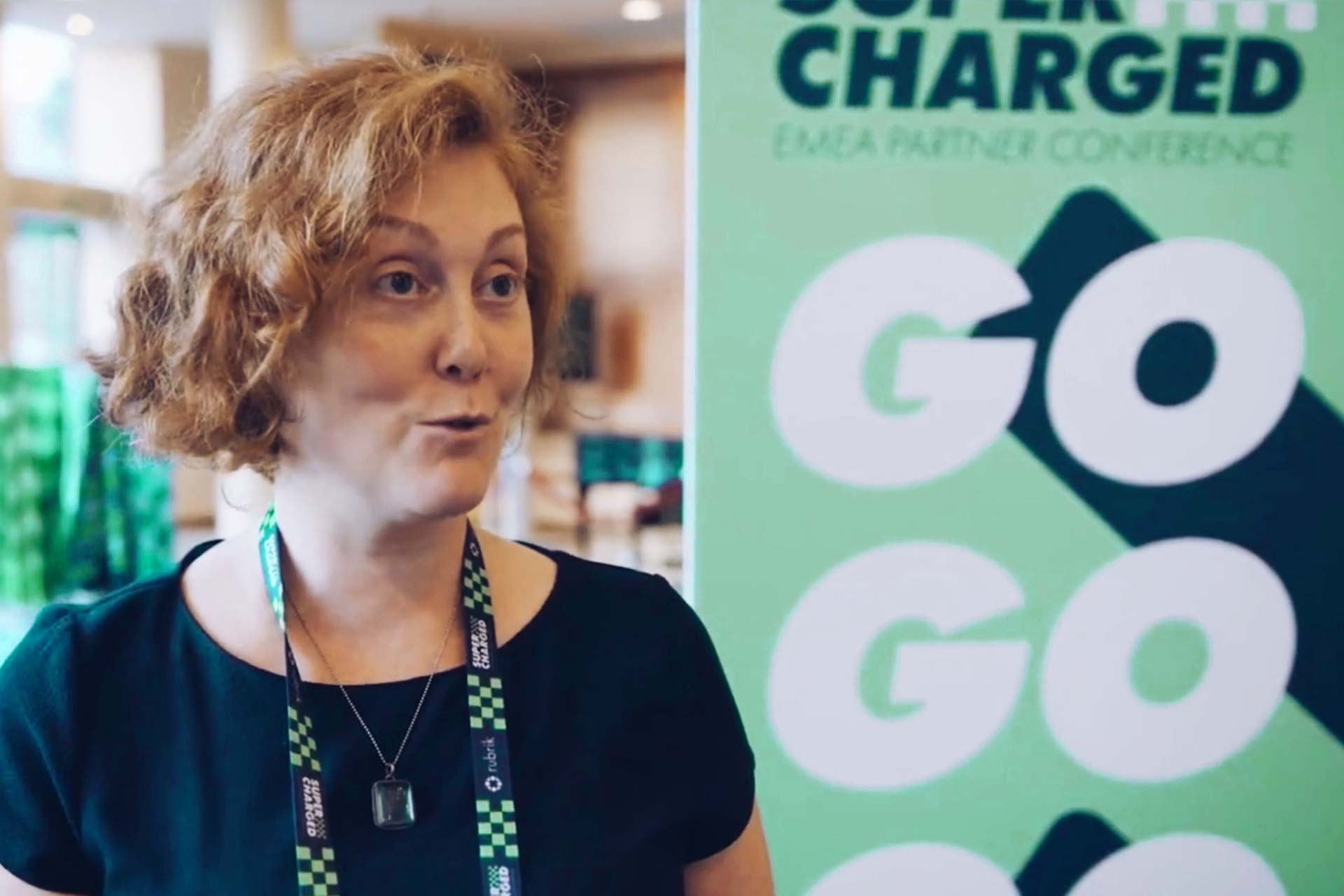
We spoke at length with Rubrik and certain words started cropping up over and over: fast, leading, speed, progress, quick, responsive. They put us in mind of racing and the classic Formula One discourse. More specifically the iconic commentary by Murray Walker "Go Go Go!".
The Concept
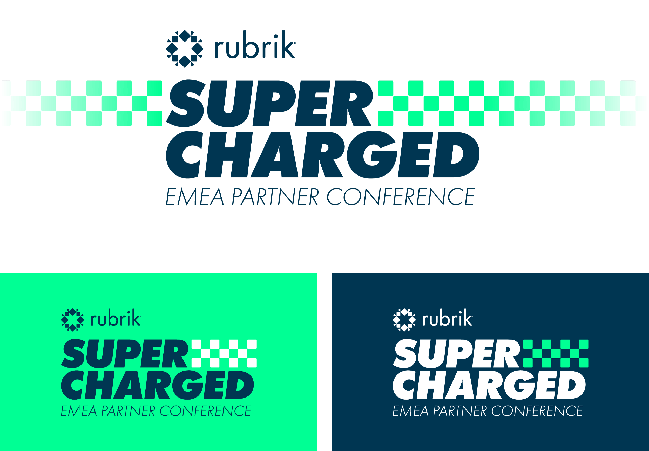
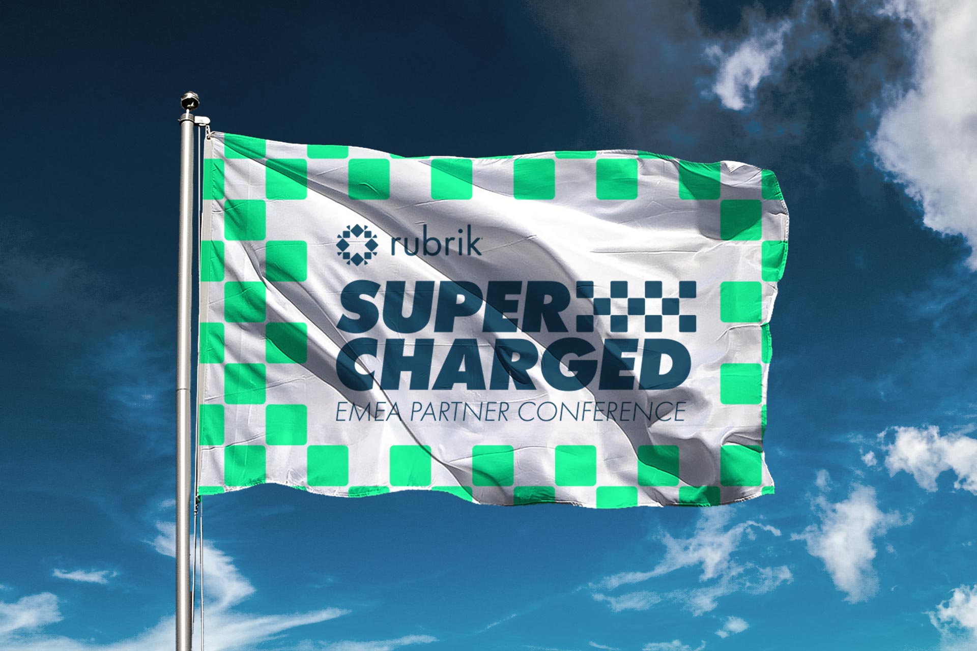
We explored the racing concept further and found that it was perfect for building an identity around the conference. We settled on the name Supercharged as we felt it represented how Rubrik are expanding and thriving at an awesome rate, winning awards, working with incredible partners, all whilst managing to push forward and improve their services.
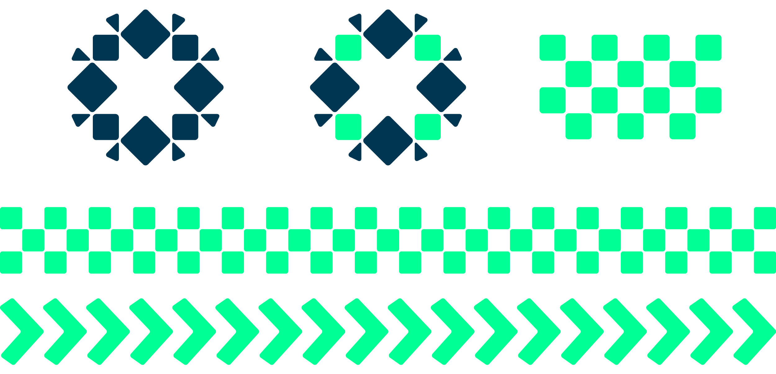
From here we had a great base from which to start playing with the wider identity, we were inspired by the grids at the starting line and started playing with checkers. Then we experimented with tyre track style patterns, we couldn't wait to see this feature on a track day style flag.
The Design
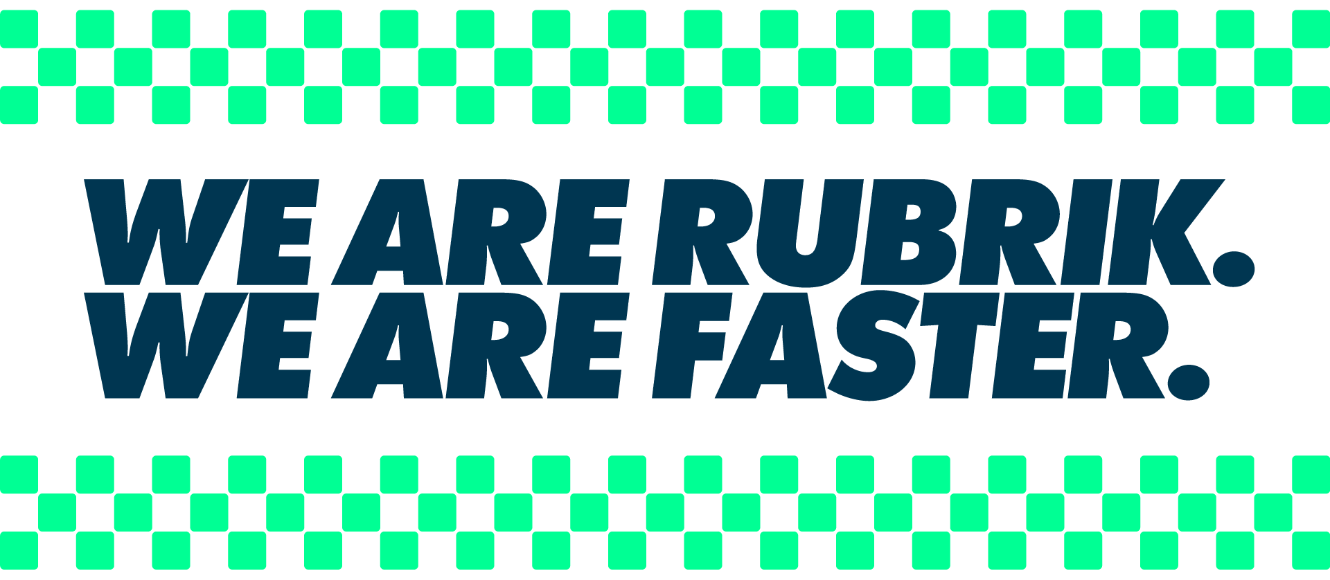
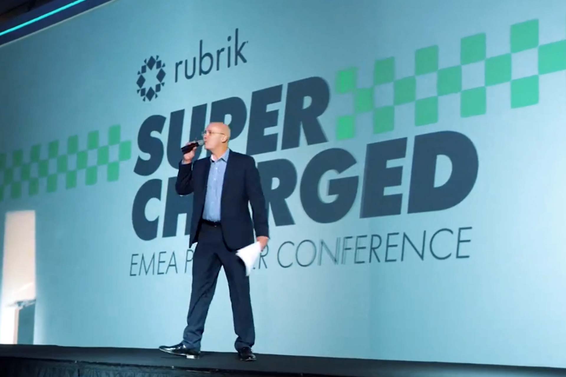
The colours we chose are inspired by Rubrik’s colour palette, we wanted the colour combination to be bright and confident – a modern take on the traditional race colours. We animated the arrows and the text to introduce each key speaker which really helped bring the brand to life on stage. We chose a classic, extra bold typeface to complement this dynamic design style. We love that the type itself looks almost like it is moving forward, it looks fast and we absolutely love the way it looks when we write up the strapline of the conference.
The Result
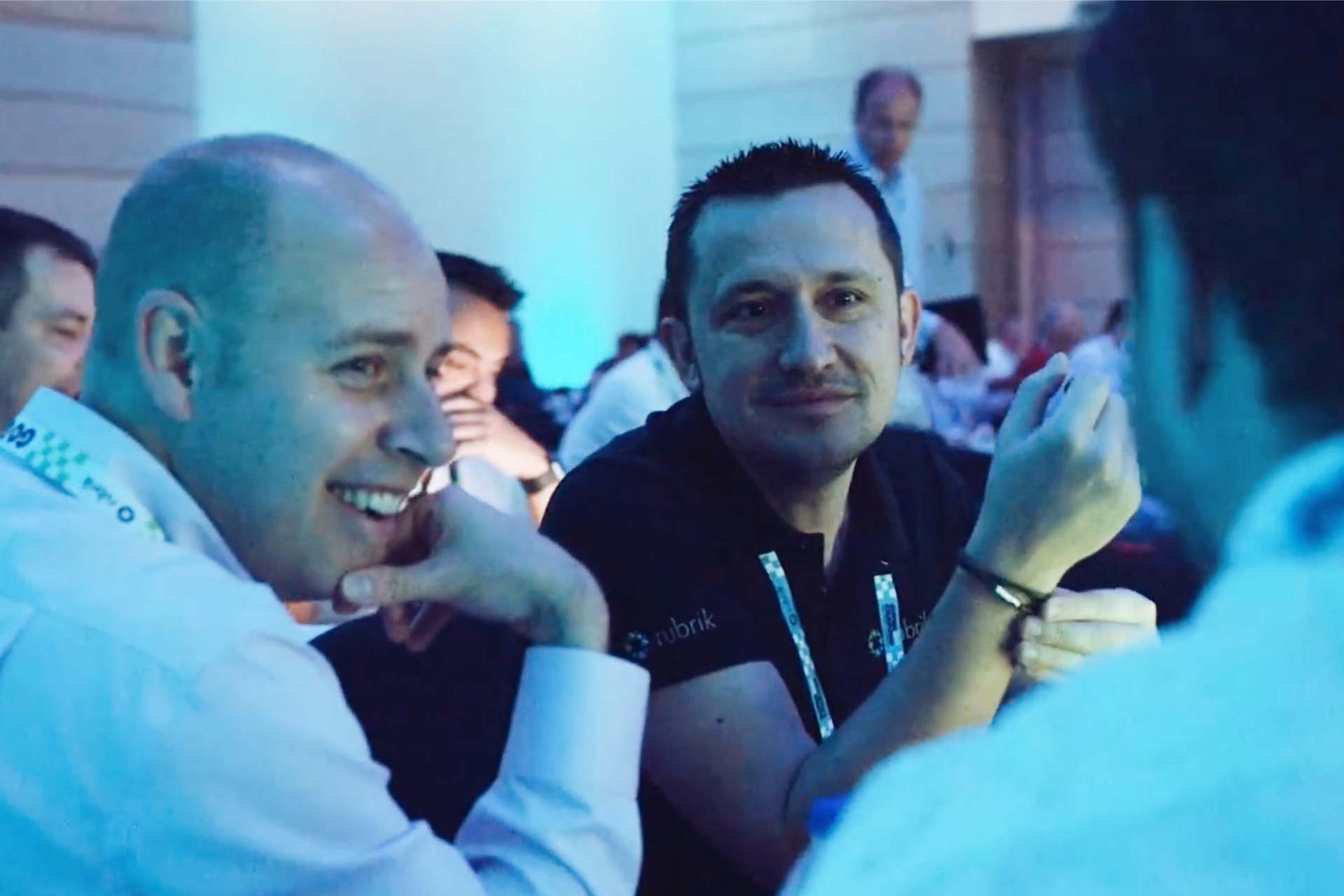
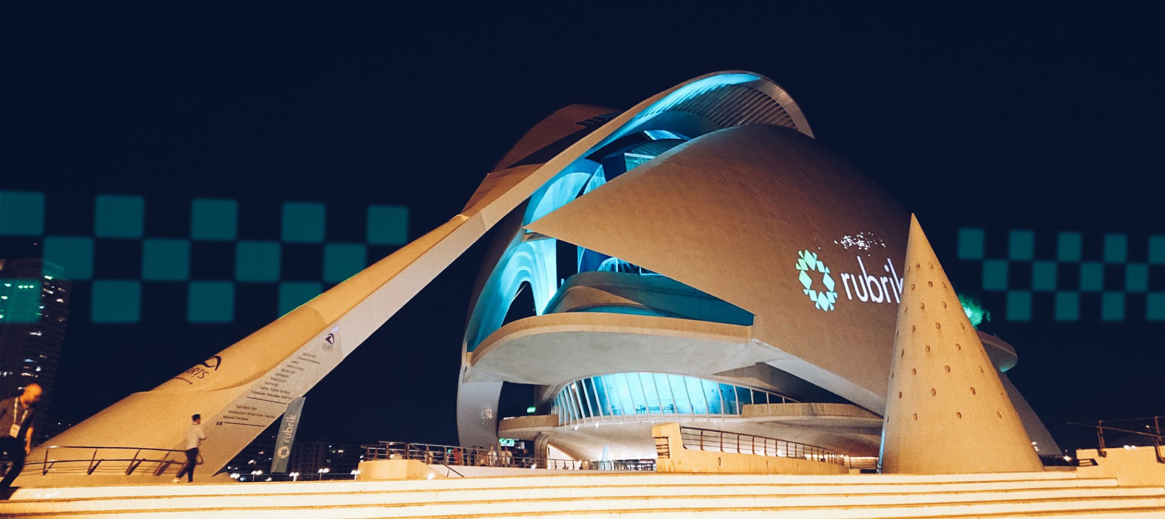
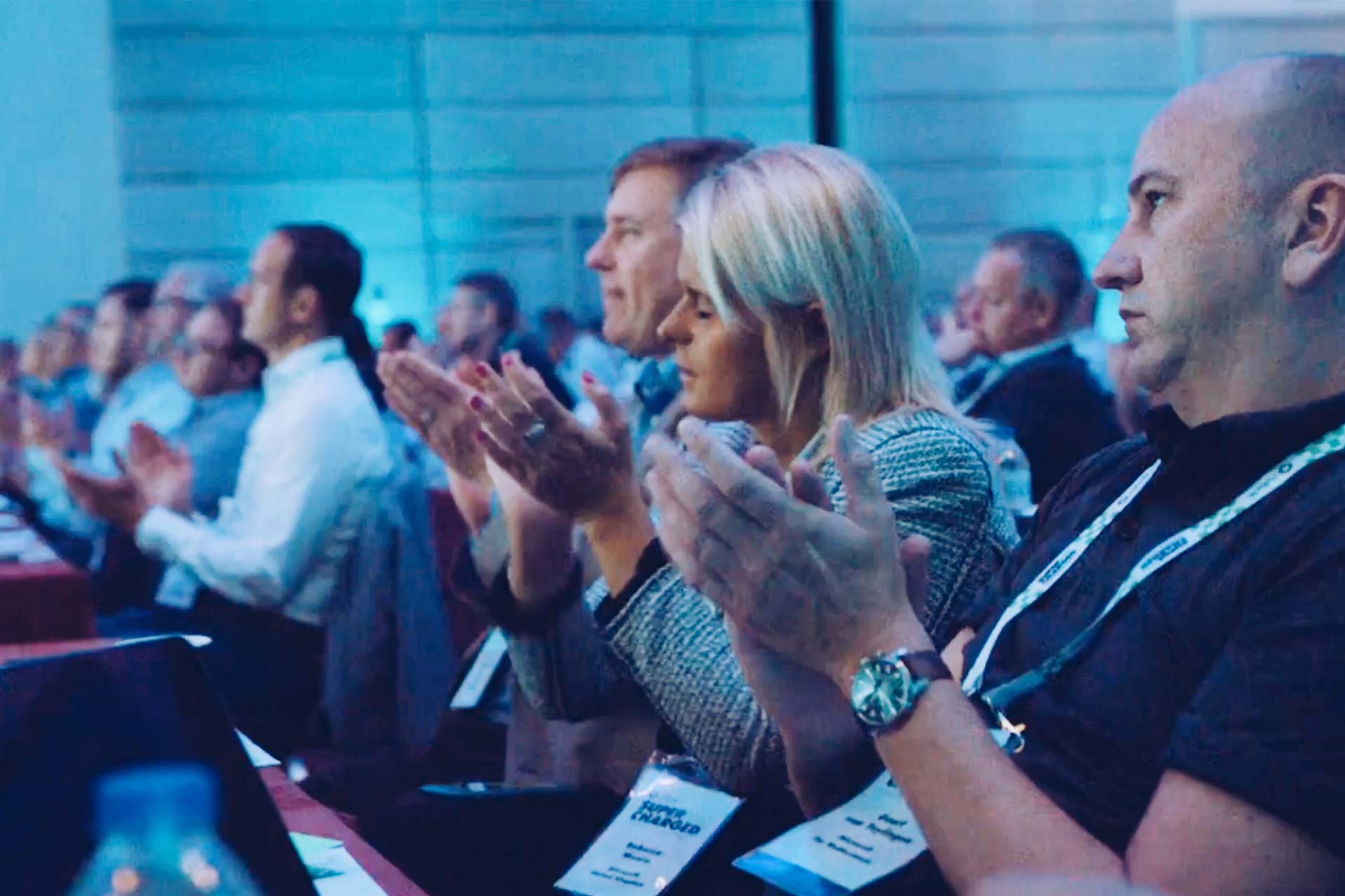
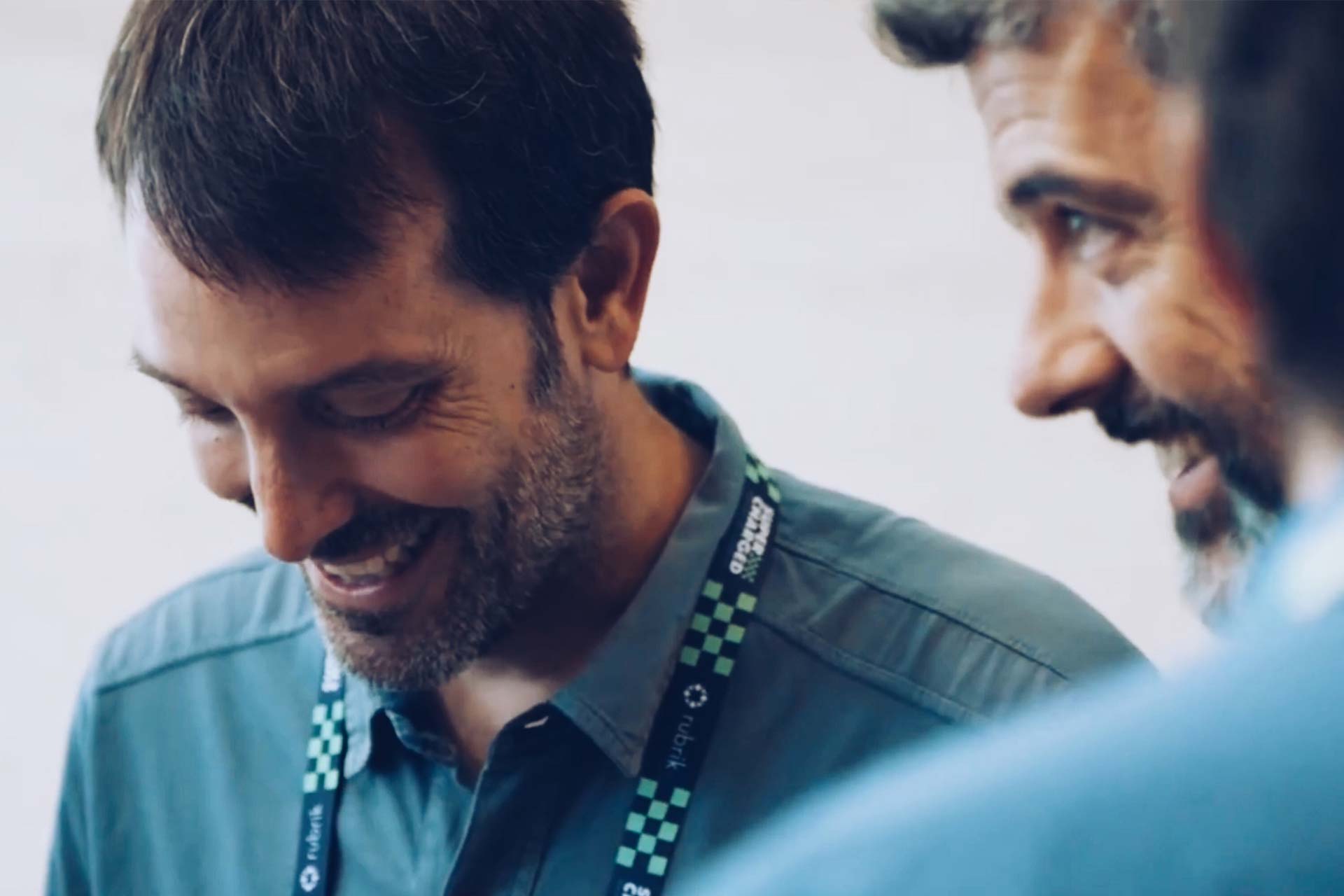
Rubrik’s partner conference went down a storm, it sounds like everyone had a brilliant time and we were so excited to see the Supercharged design applied across the event. There’s a nice recap of the event here. In terms of clients, Rubrik are a dream—ambitious, dynamic and believers in the power of good design.